THE DRILL
Project Summary
The Drill is a level made for Unreal Tournament. It is a catch-the-flag first person shooter level. The level was made as part of an assignment, where one side of the level was supposed to be designed for defence, while the other side should be more suited for offence.
The main focus in this project was on balancing the gameplay to make sure that neither team became overpowered compared to the other. This was done using cover placement, pickup and powerup placement, elevation differences, and so on. It was one of the most challenging assignments at TGA, but one were I evolved a lot as a level designer.
Blockout and Design
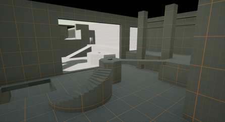
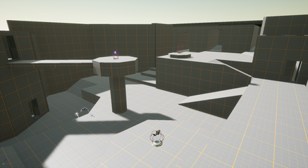
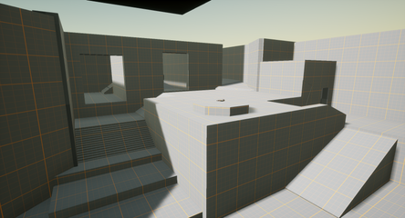
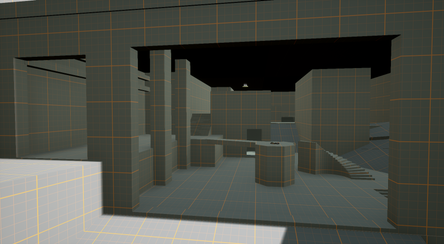
The first half of the project was spent blocking out the entire level using simple shapes. I combined both inside and outside areas for a more varied environment. The flag that was going to be easier to defend, I put in the inside area. The flag that was supposed to be harder to defend I put outside where it was more clearly visible.
I put the spawn area of the "attacking" team at a higher elevation, as moving downward tends to be easier/faster than moving upwards. The spawn area of the "defending" team was put behind the inside area, in a way which incentivized slower movement and staying closer to their own flag.
Placing weapon pickups was one of the trickiest parts, as some weapons were powerful enough to immediately throw off the balance between the teams. Placing them in a way which kept the balance of the level required a lot of playtesting and tweaking.
One thing that I would do differently if I were to redo this level, is to increase the distance between the flags. While the elevations and higher risk areas delayed the movement between the flags, the distance still felt a bit short, resulting in quite quick matches.
Polish
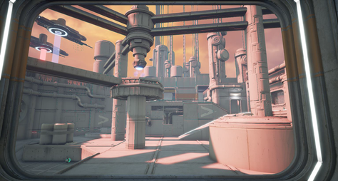
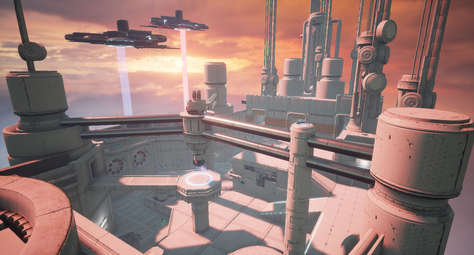
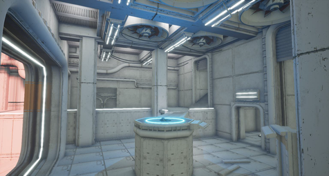
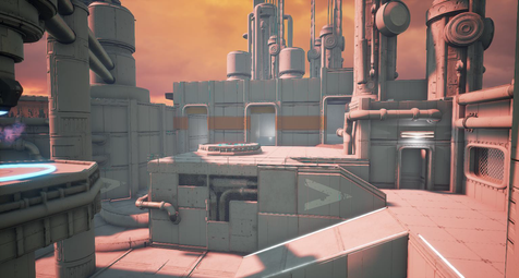
After playtesting and balancing the blocked out level, I spent the next half of the project polishing the level with props provided by the unreal tournament editor. Even in the polishing stage, I tried to keep the level design in mind, thinking of how to best use props and colors to guide the player. I wanted the player to be able to immediately tell where in the level they are, and which team's side of the level they're looking towards. Therefore, I tried my best to use obvious landmarks and to make each spawn area stand out visually. This helped a lot in being able to quickly orient oneself in the level. I even used a gradient skybox, with a red sky overlooking the red teams spawn and a bluer part of the sky ovelooking the blue teams spawn. I also used decals and pointlights to guide the player through the level.

